

Demandwell
Title: Product Designer
Project type: Web app, SEO reporting, email design
Team: Tanner Brumbarger - Product Manager
Grady Neff - Product Manager
Ethan Grove - Product Lead
Tools used: Figma, Jam, Otter, Zoom, Notion, Google Workspace, GitHub, Pendo, Gong.io
Overview: Demandwell was looking to update their product suite and various facets outside of it. I was brought on to co-lead design efforts and focus specifically on revamping their reporting suite and redesign their email UI and workflow.

My role
During my tenure, I was the lead designer on three main products: Reporting v1.1, Content Order Emails, and Freemium
I collaborated with two product managers, and our CTO, finally coordinating the handoff with engineering.
Throughout the whole design process, we gathered and applied feedback from stakeholders such as our CEO, Director of Engineering, Head of Services, and SEO consultants as needed.
Once final designs were vetted by the necessary stakeholders, files were prepared for handoff.
After the initial handoff, I was available for questions and revisions through QA as needed from said stakeholders.
The problem:
The platform had an embattled road to shipment and launch. As I joined the team, our primary concern was optimizing the product so that the Product Team could shift their focus to the needs of the C-Suite and shareholders, and on other more pressing product needs.
1. Lack of metric visibility
Insights gathered from discussions with users and consultants reflected a clear dissatisfaction with Demandwell’s proprietary Reporting app.
The main shortfall of the platform experience was an inability to easily visualize and communicate metric totals singularly and against each other in a multi-view capacity.
Shown here is an example of the pre-update state of how users were viewing their reporting data:
2. Overlooked necessities
In addition to single and multi-metric visualizations, a variety of small housekeeping features were also needed for Reporting 1.1.
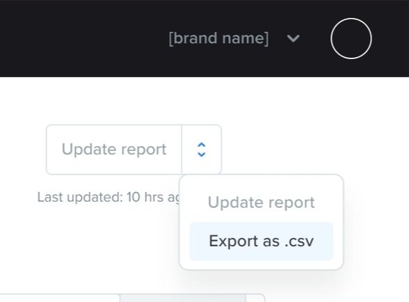
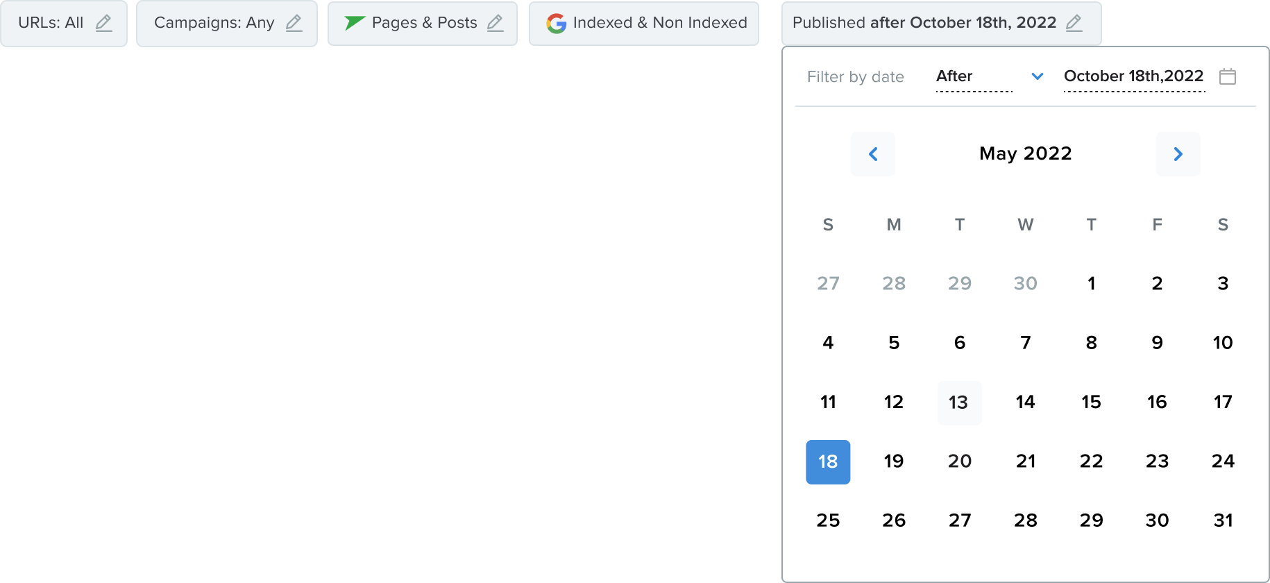
These additions included a cost-per-click metric integration, a y-axis toggle for viewing multiple selections against a timeline, a way for users to export all their report data to a .csv file along with email notifications, and a content filter for users to view the effectiveness of their published content within a certain timeframe.
3. Simplicity over style
This software’s purpose was to make ourcustomers’ lives easier. Therefore, we chose to value simplicity over intricate and flashy design. We wanted to understand the top needs of our users and meet those objectives as directly as possible.

Research
The primary challenge I needed to solve and research for Reporting 1.1 was metric visualization.
My primary source of inspiration in regard to the metric totals visualization feature for this product was Google Search Console’s (GSC) metric total visualization
Knowing the user would likely be switching between GSC and Demandwell’s Reporting app, I wanted to utilize their familiarity with Google’s interface and expand upon it to provide a seamless experience for them as they moved between products.
This informed me to maintain the user’s familiarity with the UI of the app so they wouldn’t feel jarred going back and forth between Demandwell’s Reporting app and GSC.
Lastly, for efficient engineering, I dove into our own product suite for design assets and common stylistic themes that would not require new builds and could translate easily into our new features.

Designs
Thanks to excellent cross-functional communication and collaboration with my PM, we were able to complete the iterative process for the initial MVP more quickly than I had estimated.
Single Metric Totals:
Multi-metric Totals


“Toggle metric” view

Dropdowns


Multiple metrics selected
Final Handoff and Shipment
The engineering team and I were able to complete the features utilizing and adapting available assets already in our software where we could, and designing new assets as needed. Ultimately, we were able to achieve the usability and functions our clients needed.
Problems Solved
Ultimately, the main issues faced by clients on a daily basis was metric visibility. I was able to solve those issues in three different ways:
1. By addressing the main concerns around providing a new template for metric and keyword totals respectively, it allows for Demandwell’s multi-metric and single metric reporting tool to work the way it was intended, catering to a fundamental user pain-point that empowers them to make full use of the software
2. By providing users with crucial features like integrating the cost-per-click metric on the included metrics that can be tracked, users are licensed to observe, either in real time or over a given period, how much they’re earning and saving utilizing Demandwell’s powerful SEO suite
3. By giving marketing directors and companies the ability to export their reporting data to a catch-all .csv file, allowing them to utilize the data gleaned from DW’s Reporting app to the fullest extent
Conclusion
Demandwell wanted a Reporting app patch that wasn’t going to need updating for the fiscal year, especially given the remaining needs of their yearly product scope.
Being able to optimize a product to the point where it won’t need a patch for the foreseeable future is always challenging because it's impossible to preempt possible roadblocks and user needs.
On this product, I prioritized simple design to provide a practical and high-functioning solution to our clients. Choosing to balance maximum impact and efficiency meant designing clean and sensible UX with repurposed features, effectively meeting user pain-points and stakeholder requirements alike.